Updates
21 Mar, 2023
v3.12.0: New option to disable smooth scroll
New features
- The plugin exposes new functions:
| Function | Destination |
|---|---|
`jumpToNextDestination` | Jump to the next destination |
`jumpToPreviousDestination` | Jump to the previous destination |
- The
`Viewer`component adds a new property to disable smooth scroll:
<Viewer enableSmoothScroll={false} />
- It's possible to set the range of pages that will be pre-rendered. The range consists of the visible pages and some pages before and after the visible pages.
import type { SetRenderRange, VisiblePagesRange } from '@react-pdf-viewer/core';const setRenderRange: SetRenderRange = React.useCallback((visiblePagesRange: VisiblePagesRange) => {return {startPage: visiblePagesRange.startPage - 10,endPage: visiblePagesRange.endPage + 10,};}, []);// Another usage: render the first 20 pages initiallyconst setRenderRange: SetRenderRange = React.useCallback((visiblePagesRange: VisiblePagesRange) => {return {startPage: visiblePagesRange.endPage <= 20 ? 0 : visiblePagesRange.startPage - 5,endPage:visiblePagesRange.startPage <= 20? Math.max(20, visiblePagesRange.endPage + 5): visiblePagesRange.endPage + 5,};}, []);<Viewer setRenderRange={setRenderRange} />;
- The
`Cover`component adds new`width`property:
const { Cover } = thumbnailPluginInstance;// Render the cover of second page<Cover getPageIndex={() => 1} width={300} />;
Improvements
- Custom elements added to the page layer can be positioned outside of the page
- Improve the performance by removing many unnecessary rerenders. They are triggered when smooth scrolling or entering the full-screen mode
- Uses can zoom by pinching a trackpad
- The page navigation plugin adds more shortcuts:
| Shortcut | Operating System | Action |
|---|---|---|
`Command` + `ArrowLeft` | macOS | Jump to the previous bookmark destination |
`Alt` + `ArrowLeft` | Windows | Same as above |
`Command` + `ArrowRight` | macOS | Jump to next bookmark destination |
`Alt` + `ArrowRight` | Windows | Same as above |
Bug fixes
- The
`Viewer`component scrolls to the`initialPage`page automatically after resizing the container or browser - The viewer doesn't keep the current page when entering the full-screen mode in some cases
Breaking change
- The
`jumpToDestination`function now has only a single property. You don't have to change anything if your application doesn't have any custom plugin using the`jumpToDestination`function.
// Beforeimport type { DestinationOffsetFromViewport } from '@react-pdf-viewer/core';import { SpecialZoomLevel } from '@react-pdf-viewer/core';jumpToDestination(pageIndex: number,bottomOffset: number | DestinationOffsetFromViewport,leftOffset: number | DestinationOffsetFromViewport,scaleTo?: number | SpecialZoomLevel);// Afterimport type { Destination } from '@react-pdf-viewer/core';jumpToDestination(destination: Destination);
27 Jan, 2023
v3.11.0: Thumbnails direction
New features
- Add
`pagesContainerRef`to`RenderViewer`, so the plugin can access the pages container more easily - The
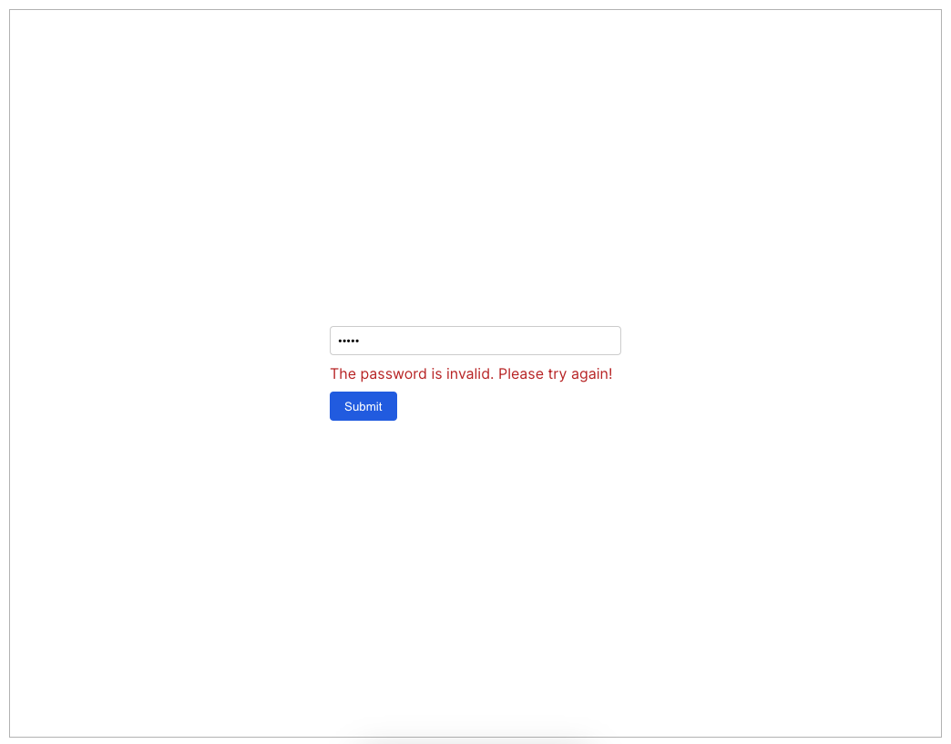
`Viewer`component adds new property to customize the view of a protected document:
import { RenderProtectedViewProps, Viewer } from '@react-pdf-viewer/core';const ProtectedView: React.FC<RenderProtectedViewProps> = ({ passwordStatus, verifyPassword }) => {...};<Viewer renderProtectedView={renderProps => <ProtectedView {...renderProps} />} />
See the customize the protected view example.
- The page navigation plugin exposes functions to jump to the previous and next pages
import { pageNavigationPlugin } from '@react-pdf-viewer/page-navigation';const pageNavigationPluginInstance = pageNavigationPlugin();const { jumpToNextPage, jumpToPreviousPage } = pageNavigationPluginInstance;
- The
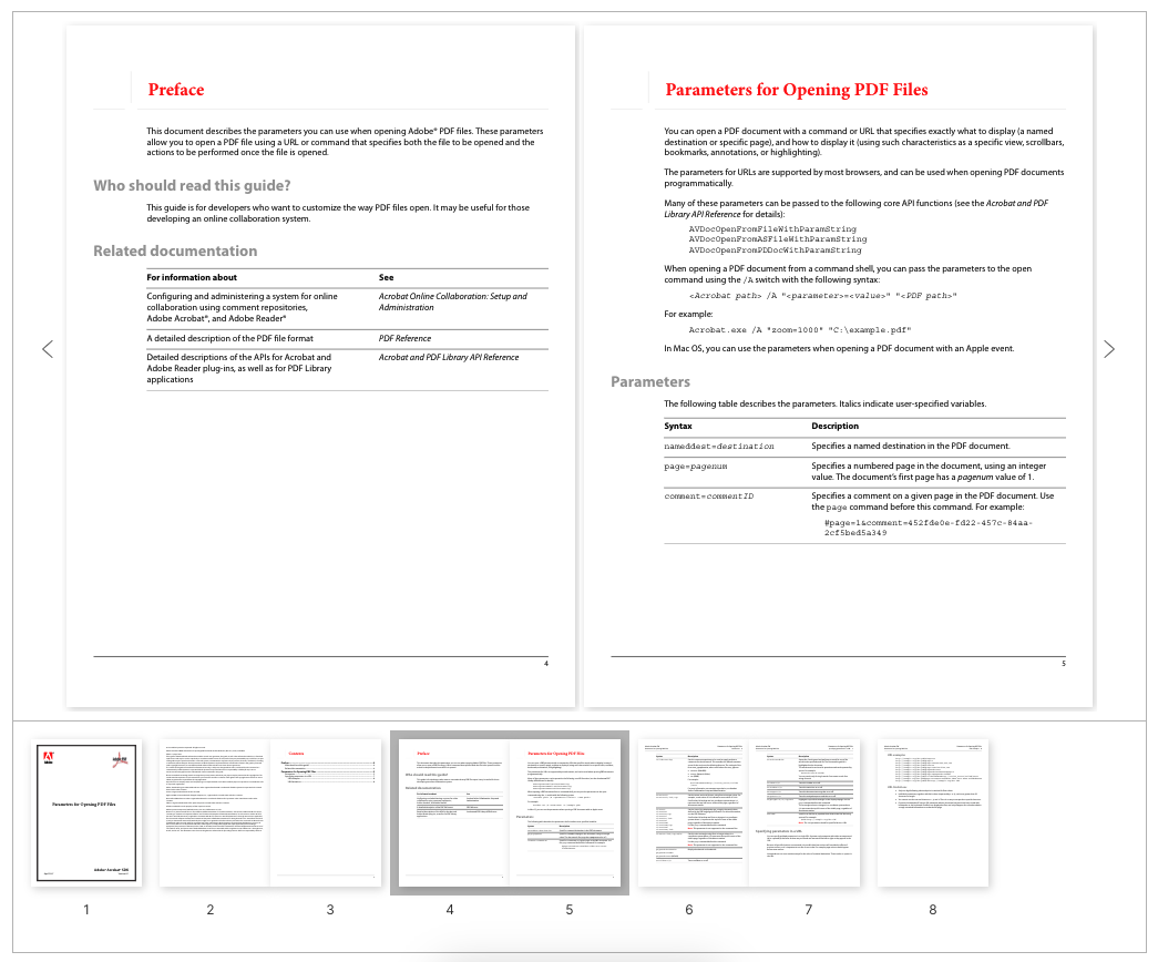
`Thumbnails`component provides new property to display the thumbnails in the given direction:
import { ThumbnailDirection } from '@react-pdf-viewer/thumbnail';// Display thumbnails horizontally<Thumbnails thumbnailDirection={ThumbnailDirection.Horizontal} />// Display thumbnails vertically<Thumbnails thumbnailDirection={ThumbnailDirection.Vertical} />
It is useful to create a magazine layout as shown in the following screenshot:
Improvements
- Change the shortcuts to behave identically as other applications (such as Adobe Acrobat):
| Shortcut | Operating System | Action |
|---|---|---|
`Command` + `ArrowLeft` | macOS | Jump to previous clicked link annotation |
`Alt` + `ArrowLeft` | Windows | Same as above |
- Support pdf-js 3.2.146
- The thumbnails are updated to look identically to the pages when users change the viewmode
Bug fixes
- The dual page viewmode doesn't work well with the initial page (
`initialPage`) option - Page navigation doesn't move to the final page properly
Breaking change
- The PageLayout's
`tranformSize`property is changed to`transformSize`
28 Dec, 2022
v3.10.0: New viewmodes
New features
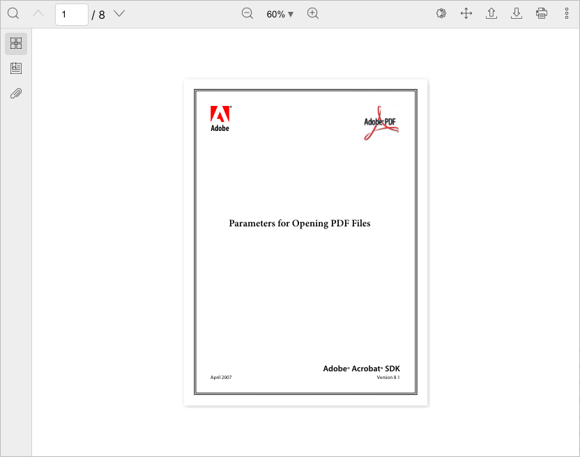
- New page scrolling mode:
import { ScrollMode, Viewer } from '@react-pdf-viewer/core';<Viewer scrollMode={ScrollMode.Page} />;
You can switch to the page scrolling mode from the toolbar.
- New three page viewmodes:
import { ViewMode, Viewer } from '@react-pdf-viewer/core';<Viewer viewMode={ViewMode.DualPage} />;
| Mode | Description |
|---|---|
`ViewMode.SinglePage` | The default mode. View single page continuously |
`ViewMode.DualPage` | View two pages each time |
`ViewMode.DualPageWithCover` | View two pages each time. The first page is displayed as a cover |
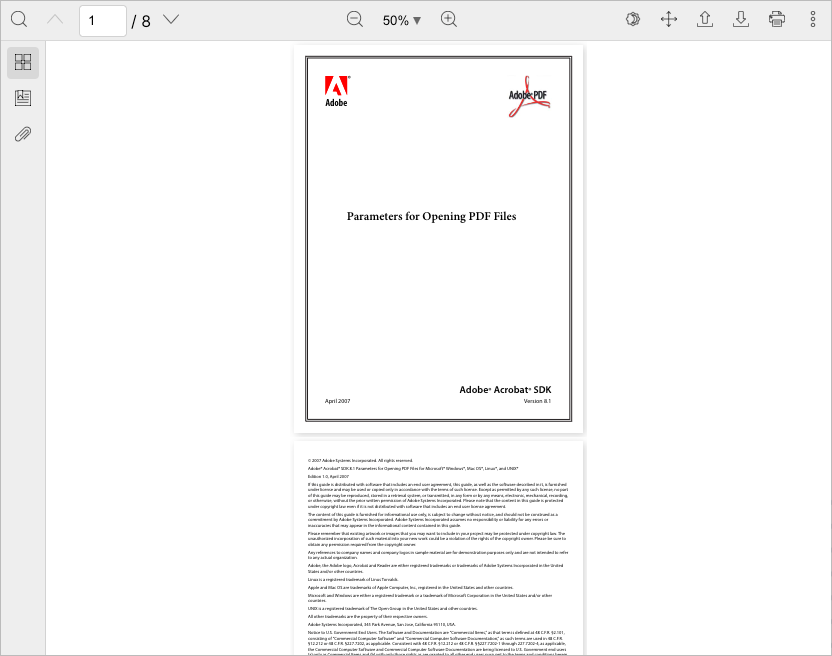
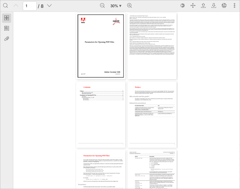
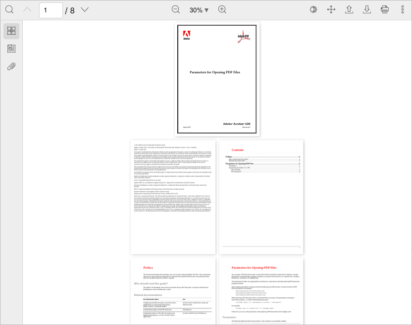
You can combine the
`scrollMode` and `viewMode` options. The following screenshot demonstrates how to apply the dual page viewmode and page scroll mode.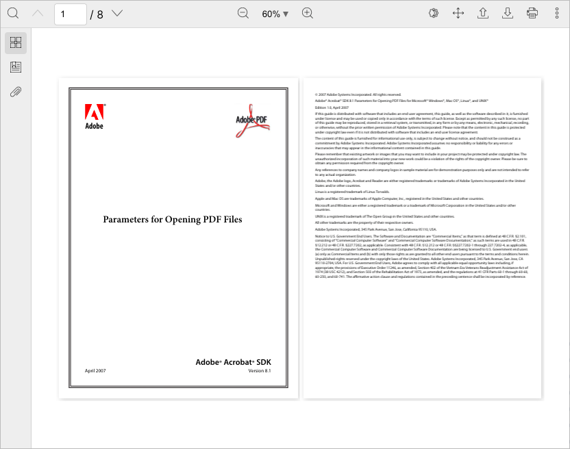
-
`PluginFunctions`provides new`jumpToPreviousPage`and`jumpToNextPage`to jump to the previous and next pages -
The scroll mode plugin provides new
`DualPageCoverViewModeIcon`,`DualPageViewModeIcon`and`PageScrollingIcon`icons
Bug fixes
- Jumping to the previous and next pages in wrapped scrol mode don't work properly
- Zooming doesn't keep current position properly
30 Nov, 2022
v3.9.0: Add margin between pages
New feature
- New
`pageLayout`option to customize the layout of each page. The following code adds margin between pages, and center the page in its container:
import { type PageLayout, Viewer } from '@react-pdf-viewer/core';const pageLayout: PageLayout = {buildPageStyles: () => ({alignItems: 'center',display: 'flex',justifyContent: 'center',}),tranformSize: ({ size }) => ({ height: size.height + 30, width: size.width + 30 }),};<Viewer pageLayout={pageLayout} />;
Bug fixes
- Keep the current page after rotating the document
Fix bugs that might happen with a document whose pages have different dimensions
- Clicking a link annotation doesn't go to the correct destination position
- Don't scroll to the top of the target page corresponding to the
`initialPage`option
Breaking change
- The
`pageHeight`and`pageWidth`properties in`RenderViewer`are replaced with the`pageSizes`property that are the sizes of pages. You don't have to do anything if you don't develope your own plugin using those properties.
09 Nov, 2022
v3.8.0: Improve highlight plugin
New features
- Set the initial rotation with the new
`initialRotation`parameter:
<Viewer initialRotation={90} />
- The highlight plugin provides new function to switch the trigger mode:
const highlightPluginInstance = highlightPlugin();const { switchTrigger } = highlightPluginInstance;// Switch to NoneswitchTrigger(Trigger.None);// Switch to Selection modeswitchTrigger(Trigger.TextSelection);
- Users can click and drag to highlight an area
Improvements
- Adjust the pointer when hovering the mouse over checkboxes inside the search popover
- Keep the expanded/collapsed state of each bookmark
- Set the
`title`and`aria-label`attributes for link annotations without using the Bookmark plugin - Support pdf-js 3.0.279
- The
`RenderBookmarkItemProps`props includes new`path`property that indicates the path from each bookmark item to the root `SelectionData`provides more information about the selected text including:
| Property | Type | Description |
|---|---|---|
`selectedText` | `string` | The selected text |
`divTexts` | `DivText[]` | List of text items contain the selected text |
A
`DivText` item consists of| Property | Type | Description |
|---|---|---|
`divIndex` | `number` | The zero-based text element rendered by the text layer |
`pageIndex` | `number` | The zero-based page index |
`textContent` | `string` | The text content of text element |
- The open file dialog filters PDF files by default
- The search popover should perform search based on the initial keyword passed to the
`keyword`option:
const searchPluginInstance = searchPlugin({keyword: '...',});
`RenderSearchProps`adds new`isDocumentLoaded`property that indicates if the document is loaded. You can use it to perform searching for a keyword in a sidebar:
import type { Match, RenderSearchProps } from '@react-pdf-viewer/search';const SearchSidebarInner: React.FC<{renderSearchProps: RenderSearchProps}> = ({ renderSearchProps }) => {const [matches, setMatches] = React.useState<Match[]>([]);const { isDocumentLoaded, keyword, search } = renderSearchProps;React.useEffect(() => {if (isDocumentLoaded && keyword) {search().then((matches) => {setMatches(matches);});}}, [isDocumentLoaded]);return (// Display matches ...);};
Bug fixes
- Can't render certain PDF documents that contain an annotation whose destination consists of non alphabetical characters
- Popover doesn't work if the
`Viewer`is rendered inside ShadowDOM - Replace the deprecated
`contents`and`title`properties of annotations with corresponding objects - The annotation link doesn't navigate to the correct page in some cases
- The
`Cover`component doesn't rotate the corresponding rotated page - The
`jumpToHighlightArea`function does not work properly with some documents - The
`startPageIndex`and`endPageIndex`properties of`SelectionData`aren't correct
Breaking change
- In addition to selecting texts, users can click and drag to highlight a particular area. The second way doesn't provide the
`SelectionData`data. The`SelectionData`property in`RenderHighlightContentProps`and`RenderHighlightTargetProps`turn to optional properties.
interface RenderHighlightContentProps {selectionData?: SelectionData;}interface RenderHighlightTargetProps {selectionData?: SelectionData;}
You have to check if it exists before using it:
if (renderHighlightContentProps.selectionData) {// Do something ...}if (renderHighlightTargetProps.selectionData) {// Do something ...}
21 Aug, 2022
v3.7.0: Improve bookmark plugin
New features
- You can customize the bookmarks by using the
`renderBookmarkItem`properly:
<Bookmark renderBookmarkItem={renderBookmarkItem} />
See this example for more details.
- The default layout plugin provides new
`toggleTab`function to toggle a given tab in the sidebar:
const defaultLayoutPluginInstance = defaultLayoutPlugin();const { toggleTab } = defaultLayoutPluginInstance;// Toggle the second tabtoggleTab(1);
Improvement
- Clicking
`Command`+`ArrowUp`(on macOS) or`Ctrl`+`ArrowUp`(on Windows) will bring users to the previous clicked link annotation. You can disable that shortcuts via the`enableShortcuts`option:
// Use the standalone page navigation pluginconst pageNavigationPluginInstance = pageNavigationPlugin({enableShortcuts: false,});// Use the default layout pluginconst defaultLayoutPluginInstance = defaultLayoutPlugin({toolbarPlugin: {pageNavigationPlugin: {enableShortcuts: false,},},});
Bug fixes
- Clicking a particular bookmark might not go to the destination
- Targets of link annotations are sanitized to avoid secutiry issues
- The
`CharacterMap`type isn't available - The
`onPageChange`callback does not trigger if the current page equals to the initial page - The page navigation options are missing when creating a toolbar plugin
- The search popover always shows up after pressing shortcuts
- The viewer always navigates to previous, next pages after users press shortcuts even the document isn't focused
27 Jun, 2022
v3.6.0: Improve print plugin
New features
- Allow to choose pages when printing a document via the
`setPages`option. It is a function that takes the current document and returns the list of zero-based indexes of pages you want to print.
import type { PdfJs } from '@react-pdf-viewer/core';import { printPlugin } from '@react-pdf-viewer/print';const printPluginInstance = printPlugin({setPages: (doc: PdfJs.PdfDocument) => number[],});
Here are some examples:
// Only print the even pagesconst printPluginInstance = printPlugin({setPages: (doc) =>Array(doc.numPages).fill(0).map((_, i) => i).filter((i) => (i + 1) % 2 === 0),});// Only print the odd pagesconst printPluginInstance = printPlugin({setPages: (doc) =>Array(doc.numPages).fill(0).map((_, i) => i).filter((i) => (i + 1) % 2 === 1),});
The option is also available when using the default layout plugin:
const defaultLayoutPluginInstance = defaultLayoutPlugin({toolbarPlugin: {printPlugin: {setPages: ...,},},});
You don't have to implement functions that return popular page numbers. The print plugin provides useful functions for most popular cases:
import {getAllPagesNumbers,getCustomPagesNumbers,getEvenPagesNumbers,getOddPagesNumbers,} from '@react-pdf-viewer/print';const printPluginInstance = printPlugin({setPages: getEvenPagesNumbers,});
| Function | Description |
|---|---|
`getAllPagesNumbers` | Returns all pages numbers of the document |
`getCustomPagesNumbers` | Returns the custom page numbers. The input is a string consisting of given pages or ranges of pages. For example: |
| 1, 2, 3 | |
| 1-3 | |
| 1-3, 5, 8-11 | |
`getEvenPagesNumbers` | Returns even pages numbers |
`getOddPagesNumbers` | Returns odd pages numbers |
See this example for more details.
- The target print pages can be determined from users' input:
import { getEvenPagesNumbers } from '@react-pdf-viewer/print';const printPluginInstance = printPlugin();const { setPages } = printPluginInstance;// Show UI for users to choose pagesconst handleChooseEvenPages = () => setPages(getEvenPagesNumbers);<label><input type="radio" onChange={handleChooseEvenPages} /> Print even pages</label>;
See this example for more details.
- The print plugin exposes the
`print`function:
import { printPlugin } from '@react-pdf-viewer/print';const printPluginInstance = printPlugin();const { print } = printPluginInstance;
The
`print` function is also available if you use the default layout plugin:import { defaultLayoutPlugin } from '@react-pdf-viewer/default-layout';const defaultLayoutPluginInstance = defaultLayoutPlugin();const { print } = defaultLayoutPluginInstance.toolbarPluginInstance.printPluginInstance;
See this example for more details.
- You can customize the progress bar when preparing pages to print:
const printPluginInstance = printPlugin({renderProgressBar: (numLoadedPages: number, numPages: number, onCancel: () => void) => (// Render the progress bar),});
See this example for more details.
Improvement
import { DownloadIcon } from '@react-pdf-viewer/get-file';import { OpenFileIcon } from '@react-pdf-viewer/open';
Bug fix
- Can't search or set the initial keyword for scanned documents
14 Jun, 2022
v3.5.0: Customize the search highlighted elements
New feature
- Be able to customize the highlighted elements when searching for a keyword:
const searchPluginInstance = searchPlugin({renderHighlights: (renderProps: RenderHighlightsProps) => (// Your custom highlighted elements),});
See this example for more details.
Improvements
-
The highlight plugin supports double click. Users can double click to select the entire text of a given element
-
The page navigation plugin allows to jump to the previous and next pages with shortcuts.
| Shortcut | Action |
|---|---|
`PageUp` or `Alt` + `ArrowUp` | Go to the previous page |
`PageDown` or `Alt` + `ArrowDown` | Go to the next page |
The shortcuts are enabled by default. It's possible to disable them, for example:
// Use the standalone page navigation pluginconst pageNavigationPluginInstance = pageNavigationPlugin({enableShortcuts: false,});// Use the default layout pluginconst defaultLayoutPluginInstance = defaultLayoutPlugin({toolbarPlugin: {pageNavigationPlugin: {enableShortcuts: false,},},});
Bug fixes
- Don't highlight the entire page when selecting multiple lines
- The default layout plugin throws an exception if the
`setInitialTabFromPageMode`function returns a`Promise`which resolves an invalid tab index - The highlight plugin throws an exception when double click a page without selecting any text
- The search plugin can't set the initial keyword when using with the highlight plugin
06 Jun, 2022
v3.4.0: Set the initial tab
New feature
- It's possible to set the initial tab in the default layout:
import { defaultLayoutPlugin } from '@react-pdf-viewer/default-layout';const defaultLayoutPluginInstance = defaultLayoutPlugin({// The `Bookmark` tab is active initiallysetInitialTab: () => Promise.resolve(1),});
According to the PDF specifications, the initial tab can be determined based on the document's page mode.
If you want to follow that behaviour, then you can use the
`setInitialTabFromPageMode` function:import { defaultLayoutPlugin, setInitialTabFromPageMode } from '@react-pdf-viewer/default-layout';const defaultLayoutPluginInstance = defaultLayoutPlugin({setInitialTab: setInitialTabFromPageMode,});
See this example for more details.
Improvement
Smooth scroll in every places such as
- Navigate to the previous and next pages
- Jump to a given page
- Click a thumbnail to go to a particular page
- Click a bookmark to go to a particular destination
- Jump between search results
- Jump to a given highlighted text
Bug fixes
- Can't add highlight to selected text
- Keep current position after zooming
31 May, 2022
v3.3.3: Support web optimized documents
Improvements
- Clicking
`Enter`automatically jumps to the next match when being focused on the keyword field - Support documents which are optimized for web. Users don't have to wait the full document loaded to see the first page.
Bug fixes
- Automatically scroll to the thumbnail of the initial page when it's set
- The text might not be selectable if a plugin registers the
`renderPageLayer`method - There is a page that is not rendered even it is visible when users zoom the document
08 May, 2022
v3.3.2: More issues only happen with React 18's Strict mode
Bug fixes
Fix more issues that only happen with React 18's Strict mode:
- The
`initialPage`option doesn't work - The pages are flickering when zooming the document
- There is a page that is not rendered even it is visible when users zoom the document continuously
02 May, 2022
v3.3.1: Customize the width of thumbnails
New feature
- The thumbnail plugin adds new option for customizing the width of thumbnails:
const thumbnailPluginInstance = thumbnailPlugin({thumbnailWidth: 150,});// Use with the default layout pluginconst defaultLayoutPluginInstance = defaultLayoutPlugin({thumbnailPlugin: {thumbnailWidth: 150,},});
Bug fix
- Support React 18 strict mode
<React.StrictMode><Worker workerUrl="..."><Viewer fileUrl="..." /></Worker></React.StrictMode>
19 Apr, 2022
v3.3.0: Improve bookmark plugin
New features
- The
`Bookmarks`component provides new property that can be used to set a bookmark expanded or collapsed initially. This example expands bookmarks whose depth are zero:
const setBookmarkExpanded = ({ bookmark, depth, doc, index }) => {// `bookmark` is the bookmark data structure// `depth` is the current depth// `doc` is the current document// `index` is the zero-based index of bookmark relative to its parentreturn depth === 0;};<Bookmarks isBookmarkExpanded={setBookmarkExpanded} />;
Expanding or collapsing all bookmarks initially can be done easily:
// Expand bookmarks initiallyconst setBookmarkExpanded = ({ bookmark, depth, doc, index }) => true;// Collapse bookmarks initiallyconst setBookmarkExpanded = ({ bookmark, depth, doc, index }) => false;
- The Page Navigation plugin provides new
`NumberOfPages`component that displays the total number of pages
Improvements
- Align bookmark titles
- Compatible with React 18
- In previous versions, all bookmarks were expanded by default. From this version, a bookmark will be shown or hidden initially depending on its data structure. You can see this behaviour on popular viewers such as Acrobat Reader.
- The toolbar slot
`NumberOfPages`provides the ability of customizing the number of pages
Bug fixes
- The hightlights are lost when the whole words option is enabled
- There is a visible page that isn't rendered when setting the zoom level as page width
04 Apr, 2022
v3.2.0: Rotate a single page
New features
- The
`Popover`component has new prop`lockScroll`which indicates whether the`body`element is scrollable or not. By default, it takes the`true`value - The
`Viewer`component adds new`onRotate`callback that is invoked when users rotate the document:
<VieweronRotate={({ direction, doc, rotation }) => {// `direction` is the rotate direction// `doc` is the current document// `rotation` is the latest rotation value}}/>
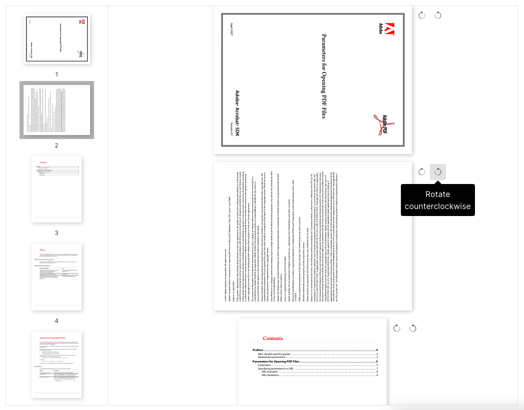
- Provide the ability of rotating a particular page. You can customize a thumbnail renderer to add the rotating functionality to each page:
const renderThumbnailItem = (props: RenderThumbnailItemProps) => (<MinimalButton onClick={() => props.onRotatePage(RotateDirection.Forward)}><RotateForwardIcon /></MinimalButton><MinimalButton onClick={() => props.onRotatePage(RotateDirection.Backward)}><RotateBackwardIcon /></MinimalButton>);const thumbnailPluginInstance = thumbnailPlugin();const { Thumbnails } = thumbnailPluginInstance;<Thumbnails renderThumbnailItem={renderThumbnailItem} />
See this example:
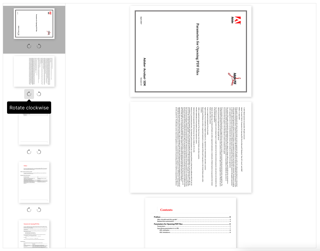
It's also possible to do it by using the
`renderPage`:const renderPage: RenderPage = (props: RenderPageProps) => (<>{props.canvasLayer.children}<div><MinimalButton onClick={() => props.onRotatePage(RotateDirection.Forward)}><RotateForwardIcon /></MinimalButton><MinimalButton onClick={() => props.onRotatePage(RotateDirection.Backward)}><RotateBackwardIcon /></MinimalButton></div>{props.annotationLayer.children}{props.textLayer.children}</>);<Viewer renderPage={renderPage} />;
See this example:
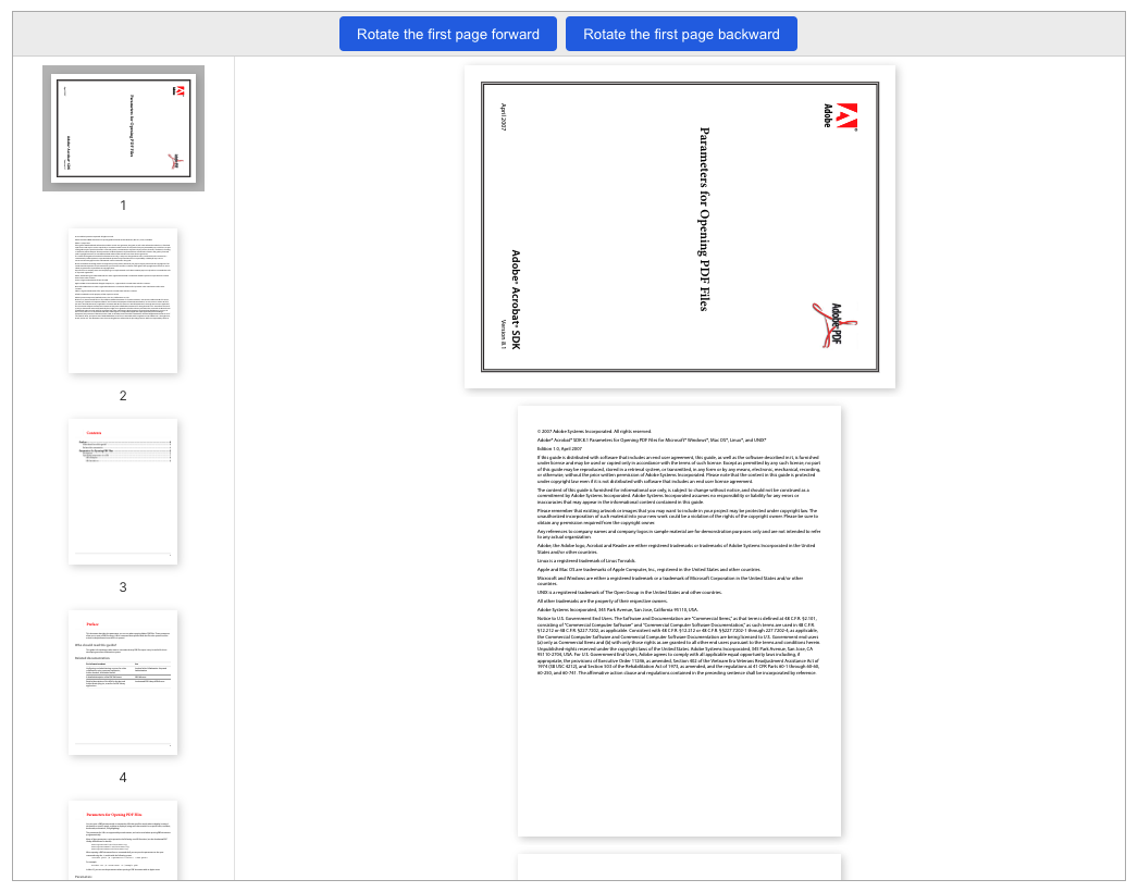
The rotate plugin adds new
`RotatePage` component in case you want to rotate a particular page from outside:const rotatePluginInstance = rotatePlugin();const { RotatePage } = rotatePluginInstance;<RotatePage>{(props) => <PrimaryButton onClick={() => props.onRotatePage(0, RotateDirection.Forward)}>Rotate the first page forward</PrimaryButton>}</RotatePage><RotatePage>{(props) => <PrimaryButton onClick={() => props.onRotatePage(0, RotateDirection.Backward)}>Rotate the first page backward</PrimaryButton>}</RotatePage>
See this example:
- The
`onRotatePage`event is triggered when a page is rotated:
<VieweronRotatePage={({ direction, doc, pageIndex, rotation }) => {// `direction` is the rotate direction// `doc` is the current document// `pageIndex` is the zero-based page index// `rotation` is the latest rotation value}}/>
Improvements
- The search popover is opened if users press the shortcuts (
`Ctrl + F`, or`Cmd + F`on macOS) when the mouse is inside the viewer container - It's able to scroll the pages when opening the search popover
- Support link annotations that have the
`unsafeUrl`property
Bug fixes
- Typo in full screen change event
- There is a visible page that isn't rendered when setting the zoom level as page width
- The thumbnails aren't rotated after rotating the document
Breaking changes
- The
`RotateDirection`provided by the`@react-pdf-viewer/rotate`package now belongs to the`@react-pdf-viewer/core`package:
// v3.1.2 and previous versionsimport { RotateDirection } from '@react-pdf-viewer/rotate';// From v3.2.0import { RotateDirection } from '@react-pdf-viewer/core';
- The
`rotate`function used in the plugins changes the parameter type:
// v3.1.2 and previous versionsrotate(90);rotate(-90);// From v3.2.0rotate(RotateDirection.Forward);rotate(RotateDirection.Backward);
08 Mar, 2022
v3.1.2: Fix search plugin issues
Bug fixes
- Don't highlight spaces between words when searching for a keyword
- The
`clearHighlights`and`clearKeyword()`functions provided by the search plugin should remove all highlights when the keyword is empty - The current highlight is lost after zooming the document
- The
`jumpToMatch()`function provided by the search plugin does not properly highlight keyword when the page is not in the virtual list - The
`ScrollModePluginProps`type isn't defined in the type definitions of the toolbar plugin
02 Mar, 2022
v3.1.1: The pages are blank initially
Improvement
- The full screen button and menu item are disabled on browsers that don't support full screen APIs. It happens on iOS Safari and iOS Chrome, for example.
Bug fixes
`onPageChange()`should fire after`onDocumentLoad()`- The pages aren't layouted properly when they have different dimensions
- The pages are blank initially until users scroll or interact with the page. It happens on some small screen sizes.
20 Jan, 2022
v3.1.0: Work smoothly on mobile; Improve performance for big document
New features
- Add new
`testId`property to`Spinner` - The
`Viewer`component provides new`scrollMode`option:
import { ScrollMode, Viewer } from '@react-pdf-viewer/core';<Viewer scrollMode={ScrollMode.Horizontal} />;
- Plugins can register and call the
`switchScrollMode`method to switch the scroll mode programatically
Improvements
- The
`Viewer`component now works on mobile.
As we know, the mobile browsers such as iOS Safari have the limit value for canvas size and the maximum memory values (256 MB on iOS Safari, for example) for rendering canvases.
It can cause the
`Viewer` component to crash if we zoom the document to a big enough level. This version fixes these kinds of issues. There is no crash on mobile anymore!- Improve the performance when rendering a document.
In the previous versions, each page is represented by a separated
`div` element. The element isn't rendered by default, and will be rendered when the corresponding page is visible in the viewport.
However, this optimization is not enough for a document that has a big number of pages.v3.1.0 brings the optimization to a new level. Instead of keeping the instance of all pages all the time, the
`Viewer` component only renders a given range of pages including the visible pages and some pages that are before and after them.
For example, if users see pages 5-8 in the screen, we will render the pages 3-10 ony. The range will be changed when users scroll up or down, and then the corresponding pages are rendered accordingly.Bug fixes
- Keep the current page after switching the scroll mode
- The Cover component has the same image source when loading different documents
- The default
`Spinner`is used when using the`renderLoader`option - The exit full screen button doesn't look good in dark theme
- The
`onPageChange`event fires more than once - The
`renderThumbnailItem`option doesn't work with dynamic document - The sidebar doesn't fit in its container on Safari
- There is a black area in the full screen mode if the zoom level is small enough
Breaking changes
- It is not possible to access the page element in a plugin with the
`getPageElement`function. The method is removed because the pages are rendered dynamically - The
`ScrollMode`provided by the`@react-pdf-viewer/scroll-mode`package now belongs to the`@react-pdf-viewer/core`package:
// v3.0.0 and previous versionsimport { ScrollMode } from '@react-pdf-viewer/scroll-mode';// From v3.1.0import { ScrollMode } from '@react-pdf-viewer/core';
- The inital scroll mode option provided by the
`scrollModePlugin`plugin now belongs to the`Viewer`component:
// v3.0.0 and previous versionsimport { scrollModePlugin, ScrollMode } from '@react-pdf-viewer/scroll-mode';const scrollModePluginInstance = scrollModePlugin({scrollMode: ScrollMode.Horizontal,});// From v3.1.0import { ScrollMode } from '@react-pdf-viewer/core';<Viewer scrollMode={ScrollMode.Horizontal} />;
- There aren't CSS styles provided by the
`@react-pdf-viewer/scroll-mode`package:
// v3.0.0 and previous versionsimport '@react-pdf-viewer/scroll-mode/lib/styles/index.css';// From v3.1.0// Remove the import above
- From v3.1.0, pages are rendered one by one. If you use a custom page renderer, then you have to call the
`markRendered`method to mark the page rendered completely. Hence the next page in the queue will be rendered.
// v3.0.0 and previous versionsimport type { RenderPageProps } from '@react-pdf-viewer/core';const CustomPageRender: React.FC<{renderPageProps: RenderPageProps;}> = ({ renderPageProps }) => {return (<>{/* Use the canvas and/or text layers */}{renderPageProps.canvasLayer.children}{renderPageProps.textLayer.children}{/* Your custom components on page ... */}</>);};<Viewer renderPage={(props) => <CustomPageRender renderPageProps={props} />} />;// From v3.1.0const CustomPageRender: React.FC<{renderPageProps: RenderPageProps;}> = ({ renderPageProps }) => {React.useEffect(() => {if (renderPageProps.canvasLayerRendered && renderPageProps.textLayerRendered) {renderPageProps.markRendered(renderPageProps.pageIndex);}}, [renderPageProps.canvasLayerRendered, renderPageProps.textLayerRendered]);return (<>{/* Use the canvas and/or text layers */}{renderPageProps.canvasLayer.children}{renderPageProps.textLayer.children}{/* Your custom components on page ... */}</>);};<Viewer renderPage={(props) => <CustomPageRender renderPageProps={props} />} />;
19 Dec, 2021
v3.0.0: New features of Full screen and Thumbnail plugins
New features
- Add new
`testId`property to`MenuItem`,`MinimalButton`,`PrimaryButton` - Be able to customize the button to exit the full screen mode:
const fullScreenPluginInstance = fullScreenPlugin({renderExitFullScreenButton: (props) => (<divstyle={{bottom: '1rem',position: 'fixed',right: '1rem',}}><button onClick={props.onClick}>Exit full screen</button></div>),});
- The full screen plugin allows to set the full screen element. The following code will include the pages container and the toolbar in the full screen mode:
const fullScreenPluginInstance = fullScreenPlugin({// `pagesContainer` is the pages containergetFullScreenTarget: (pagesContainer) => pagesContainer.closest('[data-testid="default-layout__body"]'),}),
- The thumbnail plugin adds new
`renderSpinner`property that can be used to replace the default`Spinner`component. This example displays custom loading indicators when loading the cover or thumbnail of a page:
const thumbnailPluginInstance = thumbnailPlugin({renderSpinner: () => <div className="square-spinner" />,});
- The
`Thumbnails`component adds new`renderThumbnailItem`property that is used to customize the thumbnail renderer:
const renderThumbnailItem = (props: RenderThumbnailItemProps) => (<divkey={props.pageIndex}onClick={props.onJumpToPage}style={{backgroundColor: props.pageIndex === props.currentPage ? 'rgba(0, 0, 0, 0.3)' : '#fff',cursor: 'pointer',padding: '0.5rem',}}>{props.renderPageThumbnail}</div>);const thumbnailPluginInstance = thumbnailPlugin();const { Thumbnails } = thumbnailPluginInstance;<Thumbnails renderThumbnailItem={renderThumbnailItem} />;
Improvements
- Add
`data-testid`attribute to buttons in the toolbar - The
`Cover`component uses the image instead of canvas tag - The default layout shouldn't have a horizontal scrollbar when the default scale isn't set
Bug fixes
- Navigating between search results should be the same as their appearances on pages
- The internal links don't work properly in some cases
- The thumbnails are stuck at loading spinner
- The
`Cover`component position isn't correct - The number of pages slot
`<NumberOfPages />`isn't correct when using the`renderToolbar` - There is an exception of
`React has detected a change in the order of Hooks`when switching documents
11 Nov, 2021
v2.11.0: Switch to scroll mode
New features
- The
`Button`component has new`testId`property that is identical with the`data-testid`attribute - The Scroll Mode plugin provides new function to switch mode programmatically:
const scrollModePluginInstance = scrollModePlugin();const { switchScrollMode } = scrollModePluginInstance;// Switch to the wrapped modeswitchScrollMode(ScrollMode.Wrapped);
You might find it useful when using the full screen plugin. The following sample code switches the scroll mode after entering the full screen mode:
const defaultLayoutPluginInstance = defaultLayoutPlugin({toolbarPlugin: {fullScreenPlugin: {onEnterFullScreen: (zoom) => {zoom(SpecialZoomLevel.PageFit);defaultLayoutPluginInstance.toolbarPluginInstance.scrollModePluginInstance.switchScrollMode(ScrollMode.Wrapped);},onExitFullScreen: (zoom) => {zoom(SpecialZoomLevel.PageWidth);defaultLayoutPluginInstance.toolbarPluginInstance.scrollModePluginInstance.switchScrollMode(ScrollMode.Horizontal);},},},});
Improvements
- Cache pages' labels. So we won't see blink in the current page label when navigating between pages
- Keep the file name when downloading a file opened from local
- It's possible to remove the sidebar created by the default layout plugin:
const defaultLayoutPluginInstance = defaultLayoutPlugin({sidebarTabs: () => [],});
Bug fixes
- Can't use special characters such as
`(`,`)`,`[`,`]`,`*`in the keyword - Downloading document doesn't work on iOS Safari and iOS Chrome
- The Get File plugin doesn't work with a file which is opened with credentials
- The highlight areas aren't displayed
- The
`selectedText`prop of`RenderHighlightContentProps`isn't correct
19 Oct, 2021
v2.10.1: Custom zoom levels
New feature
- The
`Zoom`and`ZoomPopover`components provided by the zoom plugin add new option to customize the zoom levels
<Zoom levels={[0.5, 1, 2, 3, 4]} /><ZoomPopover levels={[0.5, 1, 2, 3, 4]} />
Bug fix
- Clicking the Search button scrolls to the top of page
18 Oct, 2021
v2.10.0: Custom page labels
New features
- Add new
`trigger`option for the highlight plugin:
import { Trigger } from '@react-pdf-viewer/highlight';const highlightPluginInstance = highlightPlugin({trigger: Trigger.None,});
There are two possible values for the
`trigger` option:| Value | Description |
|---|---|
`Trigger.TextSelection` | Show the target after users select text. It is the default value |
`Trigger.None` | Doesn't trigger the highlight. It is often used to render the highlight areas |
- The render props of the
`CurrentPageLabel`component provided by the Page Navigation plugin includes new`pageLabel`property. It is useful if the page has a label that isn't the same as its page number:
const { CurrentPageLabel } = pageNavigationPluginInstance;<CurrentPageLabel>{(props) => (<>{props.currentPage + 1}{props.pageLabel === `${props.currentPage + 1}` ? '' : ` (${props.pageLabel})`} of {props.numberOfPages}</>)}</CurrentPageLabel>;
- The Thumbnails component displays the page labels if there are. You also can customize the page labels:
const thumbnailPluginInstance = thumbnailPlugin({renderCurrentPageLabel: (props) => (<>{props.pageIndex + 1}{props.pageLabel !== `${props.pageIndex + 1}` && `(${props.pageLabel})`}</>),});const { Thumbnails } = thumbnailPluginInstance;<Thumbnails />;
- The toolbar plugin provides the
`renderDefaultToolbar`function to create a custom toolbar from the default toolbar easily. The following sample code prepends`of`to the`NumberOfPages`component:
import type { ToolbarSlot, TransformToolbarSlot } from '@react-pdf-viewer/toolbar';const { renderDefaultToolbar, Toolbar } = toolbarPluginInstance;const transform: TransformToolbarSlot = (slot: ToolbarSlot) => {const { NumberOfPages } = slot;return Object.assign({}, slot, {NumberOfPages: () => (<>of <NumberOfPages /></>),});};// Render the toolbar<Toolbar>{renderDefaultToolbar(transform)}</Toolbar>;
Improvement
- Disable the printing functionality if the document doesn't allow to print
Bug fixes
- Can't resize the sidebar when using with the Fluent UI library
- Fix the TypeScript definition of the Cover component
- Fix an edge case where there are extra empty pages when printing a document
19 Sep, 2021
v2.9.1
Improvement
As we know, the
`Viewer` component only renders the pages which are visible in the screen. For an invisible page, users will see a spinner. However, the animation used in the `Spinner` component can slow down the app if the document has a big number of pages.This version improves the performance by animating the
`Spinner` component when it's visible only.13 Sep, 2021
v2.9.0
New features
- The
`core`package provides new`Splitter`component - The thumbnail plugin provides new
`Cover`component that shows the thumbnail of a particular page:
const { thumbnailPluginInstance } = thumbnailPlugin();const { Cover } = thumbnailPluginInstance;// Thumbnail of the first page<Cover getPageIndex={_ => 0} />// Thumbnail of the last page<Cover getPageIndex={props => props.numPages - 1} />
See the Display the thumbnail of a given page example.
- Add new
`onDocumentAskPassword`event that is triggered when a protected document requires a password to open:
const handleAskPassword = (e: DocumentAskPasswordEvent) => {// ...};<Viewer onDocumentAskPassword={handleAskPassword} />;
It can be used in cases that you want to submit the password programmatically.
Improvements
- Automatically focus on the keyword input in the search popover
- Press
`Enter`to submit the password when opening a protected document - Show the page numbers for thumbnails
- The Default Layout plugin allows to resize the sidebar
- The plugin instances which can be accessed from an instance of the Default Layout or Toolbar plugin should be readonly
- Support more shortcuts
| Shortcut | Supported plugin | Action |
|---|---|---|
`ctrl` + `cmd` + `F` or `F11` | Full screen | Enter the full screen mode |
`cmd` + `O` | Open | Open a document |
`cmd` + `F` | Search | Open the search popover |
The shortcuts are enabled by default. It's possible to disable them, for example:
// Use the standalone open pluginconst openPluginInstance = openPlugin({enableShortcuts: false,});// Use the default layout pluginconst defaultLayoutPluginInstance = defaultLayoutPlugin({toolbarPlugin: {openPlugin: {enableShortcuts: false,},},});
31 Aug, 2021
v2.8.0: Support RTL
New features
- Support RTL. You can use a RTL language such as Arabic:
import { TextDirection, Viewer } from '@react-pdf-viewer/core';<Viewertheme={{direction: TextDirection.RightToLeft,}}/>;
- The
`RenderViewer`type includes the theme context
Bug fixes
- The highlighting elements should be shown below the text, so users can still select the text
- There is an exception when opening a password protected document
23 Aug, 2021
v2.7.2
New feature
The Search plugin provides new function named
`setTargetPages` which sets the pages that you want to search in.import { searchPlugin } from '@react-pdf-viewer/search';const searchPluginInstance = searchPlugin();const { setTargetPages } = searchPluginInstance;// Only search in even pagessetTargetPages((targetPage) => targetPage.pageIndex % 2 === 0);// Only search in the page 4setTargetPages((targetPage) => targetPage.pageIndex === 3);
Improvements
- Allow to change the theme from outside of the
`Viewer`component - When the default scale is set to a special zoom level, we should keep it when resizing the window
- The
`onDocumentLoad`event and plugins'`PluginOnDocumentLoad`callback provide access to the current opened file which contains the`data`and`name`properties:
const handleDocumentLoad = (e: DocumentLoadEvent) => {console.log(e.file.name, e.file.data);};<Viewer onDocumentLoad={handleDocumentLoad} />;
Bug fixes
- Can't close the menu when using with the Fluent UI
- The
`activateTab()`method provided by the default layout plugin shouldn't toggle the tab - The
`LocalePopover`component doesn't update the localization - The pages' container overflows on initial render when setting the default scale to
`SpecialZoomLevel.PageWidth`
26 Jul, 2021
v2.7.1
Improvement
Continue improving the accessibility:
| Component | Press key | Action |
|---|---|---|
`Menu` | `End` | Focus on the last menu item |
`Home` | Focus on the first menu item |
Bug fixes
- Automatically scroll to the top of page when opening a menu
- Fix the warning when pressing the Escape key to close a modal
25 Jul, 2021
v2.7.0: Accessibility
New features
- Add new
`onSwitchTheme`option that allows to track if users switch theme. The following snippet demonstrates an example that the current theme is stored in the local storage, and is loaded back in the next user's visit:
const handleSwitchTheme = (theme: string) => {localStorage.setItem('theme', theme);};const theme = localStorage.getItem('theme') || 'light';<Viewer theme={theme} onSwitchTheme={handleSwitchTheme} />;
Improve the search plugin
-
Add new
`jumpToMatch`function which jumps to the given match -
The
`highlight`function now returns a`Promise`that holds the results. Each result also contains the matching text -
The
`core`package provides`isMac`function
Improvements
Accessibility
- Add ARIA attributes to
`Icon`,`Menu`,`MenuDivider`,`MenuItem`,`MinimalButton`,`Modal`,`Popover`,`TextBox`,`Tooltip`components - Add ARIA attributes to pages and thumbnails
- Add ARIA attributes to internal links of the document
- When the shortcuts are enabled, the associal buttons will have the
`aria-keyshortcuts`attributes - Use the keyboard to navigate between components:
| Component | Press key | Action |
|---|---|---|
`Attachments` | `ArrowDown` | Focus on the next attachment |
`ArrowUp` | Focus on the previous attachment | |
`End` | Focus on the last attachment | |
`Enter` | Download the current focused attachment | |
`Home` | Focus on the first attachment | |
`Bookmark` | `ArrowDown` | Focus on the next bookmark |
`ArrowLeft` | Collapse the current bookmark | |
`ArrowRight` | Expand the current bookmark | |
`ArrowUp` | Focus on the previous bookmark | |
`End` | Focus on the last bookmark | |
`Enter` | Click the current focused bookmark | |
`Home` | Focus on the first bookmark | |
`Space` | Click the current focused bookmark | |
`Menu` | `ArrowDown` | Focus on the next menu item |
`ArrowUp` | Focus on the previous menu item | |
`Enter` | Click the current focused item | |
`Thumbnails` | `ArrowDown` | Focus on the thumbnail of next page |
`ArrowUp` | Focus on the thumbnail of the previous page | |
`Enter` | Jump to the associate page | |
`Tooltip` | `Escape` | Close |
`Tab` | Show when being focused | |
| Close when being blured |
- Add a background color to the current search highlight
- Show a loading indicator while searching for a keyword
- The
`Spinner`component adds new`size`property
Bug fixes
- Custom search control isn't rendered
- Pressing shortcuts effects all viewer instances in the same page. The shortcuts should be enabled when the viewer gets focused.
- Remove
`br`elements generated by the recent versions of pdf.js before rendering the text layer - Remove
`keyCode`usages because it's deprecated - The print progress container loses the border
- The search popover isn't shown until the document is loaded
05 Jul, 2021
v2.6.1
Improvements
- Move the CSS variables of the default theme to
`:root`, so we can use components (`Button`,`Menu`,`Tooltip`, etc.) outside of the`Viewer` - Update the
`DownloadIcon`,`ExitFullScreenIcon`,`FullScreenIcon`and`OpenFileIcon`icons
Bug fixes
- Remove duplicate borders of keyword input
- Search results are not highlighted
- The Search plugin can cause a re-render
20 Jun, 2021
v2.6.0: Theming
From this version, all the components use the BEM naming convention for CSS classes. So if you override the styles of given class, you need to change the class.
The CSS classes are named as
`rpv-PACKAGE__COMPONENT`, `rpv-PACKAGE__COMPONENT--STATE`. For example:/* Old version */.rpv-search-highlight {...;}.rpv-search-highlight-current {...;}/* From v2.6.0 */.rpv-search__highlight {...;}.rpv-search__highlight--current {...;}
New features
- The core package provides new
`TextBox`component - Support themes. You can create a custom theme with new
`theme`option:
<Viewer theme="bootstrap" />
The main viewer then will have the class
`rpv-core__viewer--bootstrap`. You can set the value for CSS variables which are provided by plugins:.rpv-core__viewer--bootstrap {/* Custom the background color of toolbar in the default layout */--rpv-default-layout__toolbar-background-color: #eee;}
The following built-in themes are provided:
| Theme | Description |
|---|---|
`<Viewer theme='auto' />` | Switch to the dark or light mode automatically based on the system setting |
`<Viewer theme='dark' />` | The dark theme |
`<Viewer theme='light' />` | The light theme (default) |
`<Viewer theme='' />` | The light theme (default) |
- Add new theme plugin that provides components for switching between the dark and light themes
- The toolbar Slot has new
`SwitchTheme`and`SwitchThemeMenuItem`components
Improvements
- Tweak toggle icons in bookmark items
- The bookmark plugin provide new icons:
`DownArrowIcon`and`RightArrowIcon` - Improve text selection in the highlight plugin
- You can enable or disable shortcuts in the print and zoom plugins:
const printPluginInstance = printPlugin({// The shortcuts are enabled by defaultenableShortcuts: false,});const zoomPluginInstance = zoomPlugin({// The shortcuts are enabled by defaultenableShortcuts: false,});
Bug fixes
- Can't close popovers after scrolling
- Can't open any popover after printing
- Icons in menu items aren't centered horizontally
- There is an exception when jumping to the next or previous match if the keyword isn't found
Breaking changes
- The toolbar plugin doesn't include the drop plugin anymore. In order to use the drop plugin, you have to register it
- The
`Button`component provided by the`core`package is renamed to`MinimalButton` - The option
`prefixClass`of`Viewer`is removed
23 May, 2021
v2.5.0
New features
- The default layout is responsive in different screen sizes
- You can add more options that will be passed to the pdf.js
`getDocument`API:
<ViewerfileUrl="..."transformGetDocumentParams={(options: PdfJs.GetDocumentParams) =>Object.assign({}, options, {disableRange: false,disableStream: false,})}/>
- Provide more reusable components:
| Component | Provided by plugin | Description |
|---|---|---|
`DownloadMenuItem` | Get File | Download the current file |
`EnterFullScreenMenuItem` | Full screen | Enter the full screen mode |
`GoToNextPageMenuItem` | Page Navigation | Go to the next page |
`GoToPreviousPageMenuItem` | Page Navigation | Go to the previous page |
`OpenMenuItem` | Open | Open a new file |
`PrintMenuItem` | Print the current file | |
`ZoomInMenuItem` | Zoom | Zoom in the current file |
`ZoomOutMenuItem` | Zoom | Zoom out the current file |
These components are available as Toolbar slots, so it's possible to add them to a custom toolbar
Improvements
- Decrease the number of renders from twice to once when setting the default scale
- The
`Button`and`MenuItem`components have disabled state. For example, the button for going to the first page will be disabled if we're at the first page - The icons use the current color instead of hard coded one. It's easier for us to create themes
Bug fixes
- Doesn't work with NextJS because
`navigator`isn't defined - Some bookmarks are hidden initially
- The
`initialPage`and`defaultScale`options don't work together - There are big spaces between thumbnails
- Zoom the document best inside the container initially
Breaking changes
- If you are creating a custom toolbar or buttons to go to particular pages, then the following props are renamed:
| Old name | New name |
|---|---|
`GoToFirstPageProps` | `GoToPageProps` |
`GoToLastPageProps` | `GoToPageProps` |
`GoToNextPageProps` | `GoToPageProps` |
`GoToPreviousPageProps` | `GoToPageProps` |
`RenderGoToFirstPageProps` | `RenderGoToPageProps` |
`RenderGoToLastPageProps` | `RenderGoToPageProps` |
`RenderGoToNextPageProps` | `RenderGoToPageProps` |
`RenderGoToPreviousPageProps` | `RenderGoToPageProps` |
10 May, 2021
v2.4.3
Improvements
- Automatically scroll to the thumbnail that represents the current page
- Display the progress properly when printing a big document
- Improve the performance of preparing pages for print such as using a shared
`canvas`element for all pages - Keep showing a spinner until the canvas layer is rendered completely
- The print plugin supports documents whose pages have different dimensions
Bug fix
- Clicking on an internal link jumps to an incorrect page (one page after the destination one)
25 Apr, 2021
v2.4.2
Improvements
- Display the current page number in the right
- Make the content of annotation scrollable
- Support shortcuts
| Shortcut | Supported plugin | Action |
|---|---|---|
`cmd` + `p` or `ctrl` + `p` | Print the document | |
`cmd` + `-` or `ctrl` + `-` | Zoom | Zoom out the document |
`cmd` + `+` or `ctrl` + `+` | Zoom | Zoom in the document |
`cmd` + `0` or `ctrl` + `0` | Zoom | Reset zoom to 100% |
Bug fixes
- Can't delete the last remaining digit in the page number input
- Properly check whether or not the
`fileUrl`changes - Fix the issue where we see the spinner if the document has a single page and the height is smaller than the viewer's height
- Can't open the downloaded file if it was loaded with
`Uint8Array` - Annotation popup can be displayed under the previous or next page
- When users download a document loaded with
`Uint8Array`, the download file is named as`document.pdf`instead of the document blob - Clicking a bookmark doesn't jump to the destination properly in the first time if the bookmark also requires to zoom the document to fit the width
07 Mar, 2021
v2.4.1
Bug fixes
- Clicking the Download button doesn't work. It only works the file when scrolling to the second page
- Using the Default Layout plugin, we can't scroll between pages on Safari 14
- The Open file button covers other elements, so we can't click on the Download or Print buttons. This issue only happens on Safari 14
11 Feb, 2021
v2.4.0
New features
- The Search plugin provides methods to search for given keywords programatically:
| Method | Description |
|---|---|
`clearHighlights` | Clear the highlights |
`highlight` | Highlight multiple keywords |
`jumpToNextMatch` | Jump to the next match |
`jumpToPreviousMatch` | Jump to the previous match |
import { searchPlugin } from '@react-pdf-viewer/search';const searchPluginInstance = searchPlugin();const { clearHighlights, highlight, jumpToNextMatch, jumpToPreviousMatch } = searchPluginInstance;<button onClick={() => highlight(['document', 'PDF'])}>Highlight: document, PDF</button>;
See the Highlight keywords programmatically example.
- It's possible to add custom styles for highlighted area based on the keyword:
const searchPluginInstance = searchPlugin({onHighlightKeyword: (props: OnHighlightKeyword) => {if (props.keyword.source === 'document') {props.highlightEle.style.outline = '2px dashed blue';props.highlightEle.style.backgroundColor = 'rgba(0, 0, 0, .1)';}},});
See the Add custom styles to the highlighted elements example.
- The Zoom plugin exposes the
`zoomTo`function:
const { zoomTo } = zoomPluginInstance;// Zoom to a given levelzoomTo(1.5);zoomTo(SpecialZoomLevel.PageFit);
- The Page Navigation plugin provides the
`jumpToPage`function:
const { jumpToPage } = pageNavigationPluginInstance;// Jump to the third pagejumpToPage(2);
- It's possible to retrieve the instances of Attachment, Bookmark, Thumbnail, Toolbar plugins from the Default Layout plugin instance.
const defaultLayoutPluginInstance = defaultLayoutPlugin();const { attachmentPluginInstance, bookmarkPluginInstance, thumbnailPluginInstance, toolbarPluginInstance } =defaultLayoutPluginInstance;
Similarity, the Toolbar plugin instance provides the accesses to the instance of other plugins that build the toolbar:
const toolbarPluginInstance = toolbarPlugin();const {dropPluginInstance,fullScreenPluginInstance,getFilePluginInstance,openPluginInstance,pageNavigationPluginInstance,printPluginInstance,propertiesPluginInstance,rotatePluginInstance,scrollModePluginInstance,searchPluginInstance,selectionModePluginInstance,zoomPluginInstance,} = toolbarPluginInstance;
Improvements
- Support Next.js integration
- Fix a warning in the Console when using with Next.js
- The
`SingleKeyword`type in the Search plugin supports flags:
interface FlagKeyword {keyword: string;matchCase?: boolean; // `false` by defaultwholeWords?: boolean; // `false` by default}type SingleKeyword = string | RegExp | FlagKeyword;
You can use these flags when passing the keywords:
const searchPluginInstance = searchPlugin({keyword: {keyword: 'document',matchCase: true,},});
Bug fixes
- The Search plugin can find text that belongs to multiple
`span`elements - Fix the type definitions of the
`MoreActionsPopover`component in the Toolbar plugin
Breaking change
- The
`Observer`component is removed from the`@react-pdf-viewer/core`package
18 Jan, 2021
v2.3.2
Improvements
- Lazy load the document. The PDF document will be loaded if the viewer container is visible in the viewport.
Bug fixes
Fix a bug that could happen when we load multiple documents by changing
`fileUrl`. In that case, you may see the error message`Worker was destroyed``Cannot read property 'sendWithPromise' of null`
This version also fixes a potential memory leaks reported by React DevTools when we try to load new document even if the current document isn't rendered completely.
12 Jan, 2021
v2.3.1
Improvements
- The Full Screen plugin provides new callbacks that are triggered after entering and exiting the full screen mode
import { SpecialZoomLevel } from '@react-pdf-viewer/core';import { fullScreenPlugin } from '@react-pdf-viewer/full-screen';const fullScreenPluginInstance = fullScreenPlugin({// Zoom to fit the screen after entering and exiting the full screen modeonEnterFullScreen: (zoom) => {zoom(SpecialZoomLevel.PageFit);},onExitFullScreen: (zoom) => {zoom(SpecialZoomLevel.PageFit);},});
See the Zoom to fit the screen after entering the full screen mode example.
Bug fixes
- The style files are missing in the Highlight plugin
- Render highlight annotations formed by quadrilaterals
- The popup annotations aren't shown if they are children of highlight annotations
- Clicking a destination (bookmark, for example) with name of
`FitH`or`FitBH`throws an exception
22 Dec, 2020
v2.3.0
New features
- New
`highlight`plugin provides the ability of selecting and adding notes for text in the document - The Default Layout plugin allows to customize the tabs:
// `defaultTabs` is the list of default tabs which lists thumbnails, bookmarks and attachments respetivelyconst defaultLayoutPluginInstance = defaultLayoutPlugin({sidebarTabs: defaultTabs => { ... }});
We also can activate a given tab:
const { activateTab } = defaultLayoutPluginInstance;// Activate a tab// activateTab(index);
Breaking changes
- The
`getPagesRef`method in plugins are changed to`getPagesContainer`:
// Before v2.3.0interface PluginFunctions {getPagesRef(): React.RefObject<HTMLDivElement>;}// From v2.3.0interface PluginFunctions {getPagesContainer(): HTMLElement;}
You don't have to do anything if your app doesn't have a custom plugin.
- The
`authorization`option is removed. You can use the new`withCredentials`option:
// Before v2.3.0<ViewerfileUrl={...}authorization='Bearer ...'/>// From v2.3.0<ViewerfileUrl={...}withCredentials={true}httpHeaders={{'Authorization': 'Bearer ...',}}/>
16 Nov, 2020
v2.2.1
Improvements
- Keep the current page and scroll position after zooming the document
- Pre-render a few of previous and next pages of the current page, so users see the page instantly when scrolling
09 Nov, 2020
v2.2.0
New features
- Support loading PDF from a protected resource with new
`authorization`option.
import { Viewer } from '@react-pdf-viewer/core';<ViewerfileUrl={...}authorization='Bearer ...'/>
If you want to use another authorization servers or send more additional authentication headers, then use the new
`httpHeaders` option, for example:import { Viewer } from '@react-pdf-viewer/core';<ViewerfileUrl={...}authorization='...'httpHeaders={{key: value,}}/>
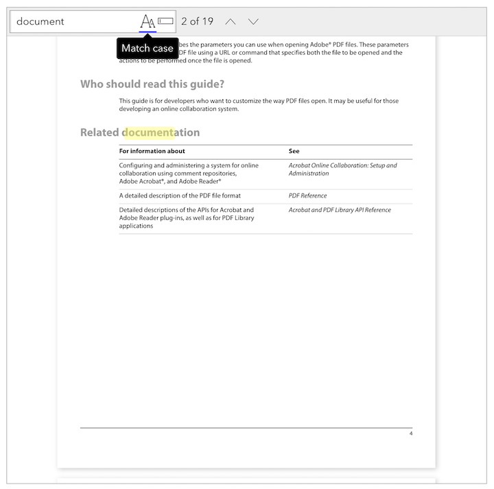
- It's possible to customize the search control with the new
`Search`component:
import { RenderSearchProps, Search } from '@react-pdf-viewer/search';<Search>{(renderSearchProps: RenderSearchProps) => (// Your custom search control)}</Search>
The parameter
`renderSearchProps` provides the properties and methods to build up a custom search control:| Property | Type | Description |
|---|---|---|
`clearKeyword` | `Function` | Clear the keyword |
`changeMatchCase` | `Function` | The result has to match case with the keyword |
`changeWholeWords` | `Function` | The result has to match the whole keyword |
`currentMatch` | `number` | The index of current match |
`jumpToNextMatch` | `Function` | Jump to the next match |
`jumpToPreviousMatch` | `Function` | Jump to the previous match |
`keyword` | `string` | The current keyword |
`matchCase` | `boolean` | `true` if the result matches case with the keyword |
`wholeWords` | `boolean` | `true` if the result matches the whole keyword |
`search` | `Function` | Perform the search with current `keyword` and `matchCase`, `wholeWords` conditions |
`setKeyword` | `Function` | Set the current keyword |
Improvements
- A current match search has a custom class
`rpv-search-text-highlight-current`. So you can customize the current match by adding CSS properties for the class. - Avoid the black flickering when clicking a bookmark
- Support both React v16 and v17
Bug fixes
- The print plugin doesn't work with the default-layout plugin
- In some cases, there is an extra blank page when printing
- Clicking bookmark doesn't jump to correct page in horizontal scroll mode
- Jumping between search match doesn't work properly in horizontal scroll mode
Breaking changes
- The
`onCanvasLayerRender`option is removed. Instead, use the`onCanvasLayerRender`option in your plugin. Take a look at the Draw on top of the canvas layer example. - The
`TextLayerRenderStatus`enum is renamed to`LayerRenderStatus`.
27 Oct, 2020
v2.1.0
New features
- Add
`onAnnotationLayerRender`hook for plugin. We can perform custom action after annotations are rendered. The following sample code creates a plugin that finds all annotation links, and add the`target="_blank"`attribute to the links:
import { AnnotationType, Plugin, PluginOnAnnotationLayerRender } from '@react-pdf-viewer/core';const customPlugin = (): Plugin => {const onRenderAnnotations = (e: PluginOnAnnotationLayerRender) => {// Find all Link annotatione.annotations.filter((annotation) => annotation.annotationType === AnnotationType.Link).forEach((annotation) => {if (annotation.url) {// Find the `a` element represents the link[...e.container.querySelectorAll('.rpv-core-annotation-link a')].forEach((linkEle) => {linkEle.setAttribute('target', '_blank');});}});};return {onAnnotationLayerRender: onRenderAnnotations,};};
- The search plugin allows to set multiple keywords to be highlighted initially
// Use the search pluginimport { searchPlugin } from '@react-pdf-viewer/search';const searchPluginInstance = searchPlugin({keyword: ['document', 'PDF'],});// Use with default-layout pluginimport { defaultLayoutPlugin } from '@react-pdf-viewer/default-layout';const defaultLayoutPluginInstance = defaultLayoutPlugin({toolbarPlugin: {searchPlugin: {keyword: ['document', 'PDF'],},},});
Improvements
- Optimize the search plugin that doesn't perform unhighligting and highlighting many times after texts are rendered
Bug fixes
- Clicking Previous match or Next match button throws an error if the keyword is empty
- Fix the incorrect path of styles
Upgrade from 2.0.1 to 2.1.0
We have to update the path of styles which are placed in the
`lib` directory. For example:// Old versionimport '@react-pdf-viewer/core/styles/index.css';// New versionimport '@react-pdf-viewer/core/lib/styles/index.css';
19 Oct, 2020
v2.0.1: Plugin architecture
This version rewrites the entire viewer with the plugin architecture. The main viewer component
`Viewer` is very lightweight, and everything else is powered by plugins.The basic setup looks like following:
// Import pluginimport { toolbarPlugin } from '@react-pdf-viewer/toolbar';// Import stylesimport '@react-pdf-viewer/toolbar/lib/styles/index.css';// Create the plugin instanceconst toolbarPluginInstance = toolbarPlugin(...);// Register plugins<Viewerplugins={[// Array of pluginstoolbarPlugin,...]}/>
New features
`Viewer`supports to use a custom loader instead of the default`<Spinner>`:
import { ProgressBar, Viewer } from '@react-pdf-viewer/core';<ViewerrenderLoader={(percentages: number) => (// You can use your own progress bar component<div style={{ width: '240px' }}><ProgressBar progress={Math.round(percentages)} /></div>)}/>;
- Customizable name of download file with the get-file plugin:
const getFilePluginInstance = getFilePlugin({fileNameGenerator: (file: OpenFile) => {// `file.name` is the URL of opened fileconst fileName = file.name.substring(file.name.lastIndexOf('/') + 1);return `a-copy-of-${fileName}`;},});
- New Locale Switcher plugin for switching between different locales
- Provide the ability of setting the scroll mode via the Scroll Mode plugin.
Bug fix
- The
`onPageChange`could be invoked several times when clicking an outline item
Breaking changes
- The
`keyword`option is removed. Use the`keyword`option provided by the search plugin. - The
`layout`option is removed - The
`render`option is removed - The
`selectionMode`option is removed. Use the`selectionMode`option provided by the selection-mode plugin. - The
`onTextLayerRender`option is removed. Instead, use the`onTextLayerRender`option in your plugin. Take a look at the Find and replace links found in each page example.
Upgrade from 1.7.0 to 2.0.1
Uninstall the old packages:
npm uninstall pdfjs-distnpm uninstall @phuocng/react-pdf-viewer
Install the new packages:
npm install pdfjs-dist@2.5.207npm install @react-pdf-viewer/core@2.0.1
Replace the old
`Worker` with new one:// Remove the old Workerimport { Worker } from '@phuocng/react-pdf-viewer';// Use the new Workerimport { Worker } from '@react-pdf-viewer/core';
Use the new
`Viewer`:- First, you might need to install the Default Layout plugin:
npm install @react-pdf-viewer/default-layout@2.0.1
- Replace the old
`Viewer`with new one:
// Old Viewerimport Viewer from '@phuocng/react-pdf-viewer';// New Viewerimport { Viewer } from '@react-pdf-viewer/core';// Pluginsimport { defaultLayoutPlugin } from '@react-pdf-viewer/default-layout';// Import stylesimport '@react-pdf-viewer/core/lib/styles/index.css';import '@react-pdf-viewer/default-layout/lib/styles/index.css';// Create new plugin instanceconst defaultLayoutPluginInstance = defaultLayoutPlugin();// Your render function<ViewerfileUrl='/path/to/document.pdf'plugins={[// Register pluginsdefaultLayoutPluginInstance,...]}/>
If you have any problems when upgrading to v2.0.1, please create a GitHub issue.
21 Jun, 2020
v1.7.0
New features
- Add
`onPageChange`callback that is invoked when user changes page:
import Viewer, { PageChangeEvent } from '@phuocng/react-pdf-viewer';const handlePageChange = (e: PageChangeEvent) => {console.log(`Changed to page: ${e.currentPage}`);};<Viewer fileUrl="/path/to/document.pdf" onPageChange={handlePageChange} />;
- Add
`onCanvasLayerRender`event that is invoked when the canvas layer is rendered completely.
import Viewer, { CanvasLayerRenderEvent } from '@phuocng/react-pdf-viewer';const onCanvasLayerRender = (e: CanvasLayerRenderEvent) => {// `e.ele` is the canvas elementconst canvas = e.ele;// Do something with the canvas element};<Viewer fileUrl="/path/to/document.pdf" onCanvasLayerRender={onCanvasLayerRender} />;
- Add
`onTextLayerRender`event that is invoked when the text layer is ready.
import Viewer, { TextLayerRenderEvent } from '@phuocng/react-pdf-viewer';const onTextLayerRender = (e: TextLayerRenderEvent) => {// For example, we can find all text elements that look like a link,// and replace it with `a` elements};<Viewer fileUrl="/path/to/document.pdf" onTextLayerRender={onTextLayerRender} />;
- Support non-latin characters via the
`characterMap`option
import Viewer, { CharacterMap } from '@phuocng/react-pdf-viewer';const characterMap: CharacterMap = {isCompressed: true,url: 'https://unpkg.com/pdfjs-dist@2.4.456/cmaps/',};<Viewer characterMap={characterMap} fileUrl="/path/to/document.pdf" />;
Bug fixes
- The viewer doesn't jump to the destination or searching result exactly
Breaking changes
The parameters of
`onDocumentLoad` and `onZoom` are changed as following:| v1.6.0 | v1.7.0 |
|---|---|
`onDocumentLoad(doc)` | `onDocumentLoad({ doc })` |
`onZoom(doc, scale)` | `onZoom({ doc, scale })` |
04 May, 2020
v1.6.0: Annotation layer
New features
-
The annotation layer is rewritten. Support the following type of annotations:
- Caret
- Circle
- File attachment
- Free text
- Highlight
- Ink
- Line
- Link
- Polygon
- Polyline
- Popup
- Square
- Squiggly
- Stamp
- StrikeOut
- Text
- Underline
-
The link annotation supports named actions which allow to jump to the first, last, next or previous pages
-
Customize error renderer.
const renderError = (error: LoadError) => {let message = '';switch (error.name) {case 'InvalidPDFException':message = 'The document is invalid or corrupted';break;case 'MissingPDFException':message = 'The document is missing';break;case 'UnexpectedResponseException':message = 'Unexpected server response';break;default:message = 'Cannot load the document';break;}return <div>{message}</div>;};<Viewer fileUrl={fileUrl} renderError={renderError} />;
Improvements
- Allow to control the
`fileUrl`option - Bookmarks support external links
- Support external links
Bug fixes
- The canvas layer is blurry
- The tooltip, popover positions are not correct in some cases
- The drag zone isn't visible if the main area is scrolled
- The document rotated initially isn't displayed properly
11 Apr, 2020
v1.5.0
New features
- Highlight given keyword in the first render
<ViewerfileUrl="/path/to/document.pdf"// The `keyword` option can be a string or a regular expression// keyword='PDF Library'keyword={new RegExp('pdf document', 'i')}/>
- Add new SVG layer which can be used to replace the canvas layer
const renderPage = (props: RenderPageProps) => {return (<>{props.svgLayer.children}{props.textLayer.children}{props.annotationLayer.children}</>);};<Viewer fileUrl="/path/to/document.pdf" renderPage={renderPage} />;
- Customize page renderer. The following code adds a simple Draft watermark at the center of every page:
const renderPage: RenderPage = (props: RenderPageProps) => (<>{props.canvasLayer.children}<divstyle={{alignItems: 'center',display: 'flex',height: '100%',justifyContent: 'center',left: 0,position: 'absolute',top: 0,width: '100%',}}><divstyle={{color: 'rgba(0, 0, 0, 0.2)',fontSize: `${8 * props.scale}rem`,fontWeight: 'bold',textTransform: 'uppercase',transform: 'rotate(-45deg)',userSelect: 'none',}}>Draft</div></div>{props.annotationLayer.children}{props.textLayer.children}</>);<Viewer fileUrl="/path/to/document.pdf" renderPage={renderPage} />;
Improvements
- The default scale can be a special zoom level. For example, we can fit page in the container initially:
<Viewer fileUrl="/path/to/document.pdf" defaultScale={SpecialZoomLevel.PageFit} />
- The
`fileUrl`option can be`Uint8Array`:
<ViewerfileUrl={new Uint8Array([...])}/>
- Add styles for error message
13 Mar, 2020
v1.4.0
New features
- Add new optional parameter indicating the page that will be displayed initially
<Viewer// The page is zero-based index// We will display the third page initiallyinitialPage={2}/>
- Add new optional parameter to define the prefix of CSS classes
<Viewer prefixClass="viewer" />
- Add new
`render`parameter that includes many functions that could be called from outside of the component:
import Viewer, { RenderViewerProps, ScrollMode, SpecialZoomLevel, SelectionMode } from '@phuocng/react-pdf-viewer';const render = (props: RenderViewerProps) => {return (<div><div style={{ height: '500px' }}>{props.viewer}</div><button onClick={() => props.jumpToPage(props.doc.numPages - 1)}>Jump to last page</button><button onClick={() => props.rotate(90)}>Rotate +90 degrees</button><button onClick={() => props.zoom(0.5)}>Zoom to 50%</button><button onClick={() => props.zoom(SpecialZoomLevel.ActualSize)}>Zoom to actual size</button><button onClick={() => props.changeScrollMode(ScrollMode.Wrapped)}>Switch to wrapped scrolling</button><button onClick={() => props.changeSelectionMode(SelectionMode.Hand)}>Switch to hand tool</button><button onClick={() => props.print()}>Print</button><button onClick={() => props.download()}>Download</button></div>);};<Viewer fileUrl={fileUrl} render={render} />;
Improvement
- All styles are moved to external CSS files. It's possible for us to override components' styles.
Bug fixes
- Can't scroll and print on IE 11
- Printing doesn't look good if the page size isn't set
05 Mar, 2020
v1.3.0
New features
Expose all the buttons from the more actions popover to the toolbar.
`ToolbarSlot` now includes`goToFirstPageButton`: the button to go to the first page`goToLastPageButton`: go to the last page`rotateClockwiseButton`: rotate the document`rotateCounterclockwiseButton`: rotate counterclockwise the document`textSelectionButton`: switch to the text selection mode`handToolButton`: switch to the hand tool mode`verticalScrollingButton`: scroll the document vertically`horizontalScrollingButton`: scroll the document horizontally`wrappedScrollingButton`: display pages as a grid`documentPropertiesButton`: show the document properties
04 Mar, 2020
v1.2.1
Improvements
- Make the spinner thiner
- Add minified CSS files
Bug fixes
- Tooltip for the left/right buttons don't look good in full width mode
- The view now takes full height by default. It fixes the issue that users can't navigate between pages from the toolbar in some cases
04 Mar, 2020
v1.2.0
New features
- Provide the ability of printing document
- Add new
`selectionMode`option indicates the selection mode:
import Viewer, { SelectionMode } from '@phuocng/react-pdf-viewer';<ViewerfileUrl="..."// By default, it will be SelectionMode.TextselectionMode={SelectionMode.Hand}/>;
- Add
`onDocumentLoad`callback that uis invoked when the document is loaded completely
import Viewer, { PdfJs } from '@phuocng/react-pdf-viewer';const documentLoad = (doc: PdfJs.PdfDocument) => {console.log(`Document is loaded: ${doc.numPages}`);};<Viewer fileUrl="..." onDocumentLoad={documentLoad} />;
- Add
`onZoom`callback that is invoked when zooming in/out the document
import Viewer, { PdfJs } from '@phuocng/react-pdf-viewer';const zoom = (doc: PdfJs.PdfDocument, scale: number) => {console.log(`Zoom document to ${scale}`);};<Viewer fileUrl="/path/to/document.pdf" onZoom={zoom} />;
09 Feb, 2020
v1.1.0
New features
- Add new, optional
`defaultScale`parameter that indicates the default zoom level:
<Viewer defaultScale={1.5} ... />
Improvement
- The document should fit best in the container initially
31 Jan, 2020
v1.0.2
Improvement
- Support SSR
Bug fixes
- Cannot re-export a type when --isolatedModules is set to true
- The CSS files are missing in es6 package
24 Jan, 2020
v1.0.0
New features
- Support password protected file
- Can open a local file or remote file which is passed by given URL
- User can drag and drop a file to open it
- Support full screen
- The text are selectable
- User can search for given keyword
- Rotate page in clockwise or counterclockwise
- Different scrolling modes: vertical, horizontal, wrapping
- Support text selection and hand mode
- Display the list of attachments in sidebar
Navigation
- Navigate between pages
- Nagivate to the first and last page quickly
- Display the thumbnails of pages in sidebar
- Display the table of contents in sidebar
- User can go to given section by following an item from the table of content
- When user click on a link, it will be opened in the browser
Zooming
- Zoom in and zoom out
- Support special zoom level such as actual size, page fit, and page width
Localization
- Support localization
- Provide built-in English locale
Customization
- Can customize the toolbar
- Can customize the layout